KETHAN

Hungry Bunny Digital Menu
Timeline
40 days
My Role
UX designer
Deliverable
Responsive web
Platform
Adobe XD
The Product
Hungry Bunny is a fast food center in Malleshwaram, Bangalore. And this is an in-house digital menu for ordering online, take away or dining in options. Customers don't need to wait for suppliers to take their order in the food center, they can order directly through the Hungry Bunny digital menu sitting at their table.
Problem
After Covid, people at restaurants are hesitant to order or converse directly with suppliers. They even complain about a lower number of payment options without a digital menu.
Solution
With Hungry Bunny’s digital menu, people at Hungry Bunny fast food center can directly order using Hungry Bunny's digital menu right outside the fast food center or they can even visit the website in order to reserve a seat, online delivery or for take aways.
Process
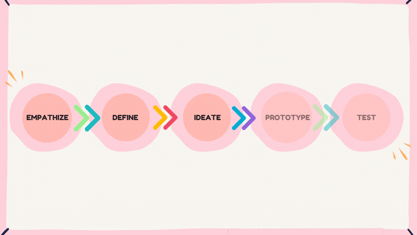
Understand the Users
I conducted user interviews, which I then turned into empathy maps to better understand the target user and their needs. I discovered that many target users wanted a different way to order their favourite fast food. However, many other digital menus are overwhelming and confusing to navigate, which frustrates many target users. This caused a normally enjoyable experience to become challenging for them, defeating the purpose of relaxation.
Persona

Sheen
Age: 22
Location: Bengaluru
Education: B.Pharm
Hometown: Madikeri
Goals
-
To get a proper digital menu.
-
A hygienic family-friendly place.
Frustration
-
Unsafe for families.
-
Not very hygienic.
-
No proper menu or prices are available at the centers.
I personally try to avoid it as much as possible due to my sensitive stomach. But we all have these desperate days when we just want to eat until we explode.
Bio
Sheen is a 22-year-old B.Pharm student who lives alone in Bengaluru. She loves to visit places and explore new things all the time.
She is frustrated as well as worried about the hygiene of the street food places she visits. But she is overwhelmed by having a conversation with new people and sellers. She expects places to be clean and give a proper menu. She even believes in digitalization as everything is converted into digital form
Sheen's User Journey
I created a user journey map of Sheen’s experience using the site to help identify possible pain points and improvement opportunities.

Sitemap
Difficulty with website navigation was a primary pain point for users, so I used that knowledge to create a sitemap. My goal here was to make strategic information architecture decisions that would improve overall website navigation. The structure I chose was designed to make things simple and easy.

Paper Wireframes
Next, I sketched out paper wireframes for each screen in my app, keeping the user pain points for navigation, browsing, and checkout flow in mind.


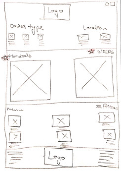

Stars were used to mark the elements of each sketch that would be used in the initial digital wireframes.

Refined Paper Wireframe
Screen Variations
As Hungry Bunny’s customers access the site on a variety of different devices, I started to work on designs for additional screen sizes to make sure the site would be fully responsive.

Mobile Version

Tablet Version
Paper to Digital
Moving from paper to digital wireframes made it easy to understand how the redesign could help address user pain points and improve the user experience.
Prioritizing useful button locations and visual element placement on the home page was a key part of my strategy.


Design Iteration
Based on the insights from the usability study, I made changes to improve the site’s checkout flow. One of the changes I made was adding the option to change order type after entering the home page from the splash page. This allowed users more freedom to edit their order type even after selecting the type of order at the beginning without ending their task just to change order type, and the menu was shifted to a whole new page.
Before Usability Study

After Usability Study

Mockups
Based on the insights from the usability study, I made changes to improve the site’s checkout flow. One of the changes I made was adding the option to change order type after entering the home page from the splash page. This allowed users more freedom to edit their order type even after selecting the type of order at the beginning without ending their task just to change order type, and the menu was shifted to a whole new page.


Hi-Fidelity Prototype
.png)
.png)
Accessibility Considerations
1
I used headings with different sized text for clear visual hierarchy.
2
I used minimal color themes across all the screens.
3
I used landmarks to help users navigate the site.
Impact
Our target users shared that the design was intuitive to navigate through, more engaging with the images, and demonstrated a clear visual hierarchy. The design even contained fewer colors for accessibility.
What I Learned?
First of all, I used Adobe XD as the major design software for this project, even though I am more familiar with Sketch and Figma. I did so to try out different tools. It was my first time creating responsive designs where I learned about screen variations.
